

Responsive Design
Responsive Websites
for Every Device
Fast, mobile-friendly and ready to convert
We build responsive websites for Brisbane businesses. They load fast, look great, and keep users engaged on every screen — performance that converts wherever your customers are.
Responsive design matters
Responsive website design that delivers on every device
Most people visit websites using their phones. If your site doesn't load fast or work smoothly, they'll leave. That first impression matters — and you often only get one chance.
We create responsive websites that adjust to fit any screen — from mobiles to tablets and desktops. Your site looks great, works well, and keeps people engaged across all devices.
Why responsive matters
Four reasons mobile-first wins
Mobile-first design
Every layout is designed for mobile first — fast load, clear structure, easy to navigate on small screens. Then scaled up to perform just as well on desktops.
Built for your business goals
More enquiries, more bookings, more phone calls — we build your site to help you achieve that on every device.
Better SEO rankings
Google gives higher rankings to mobile-friendly sites. Responsive design improves site speed, user experience, and lowers bounce rates.
Future-proof and lasting
Your site keeps working smoothly as new devices come out. Fewer rebuilds, and a website that lasts longer.
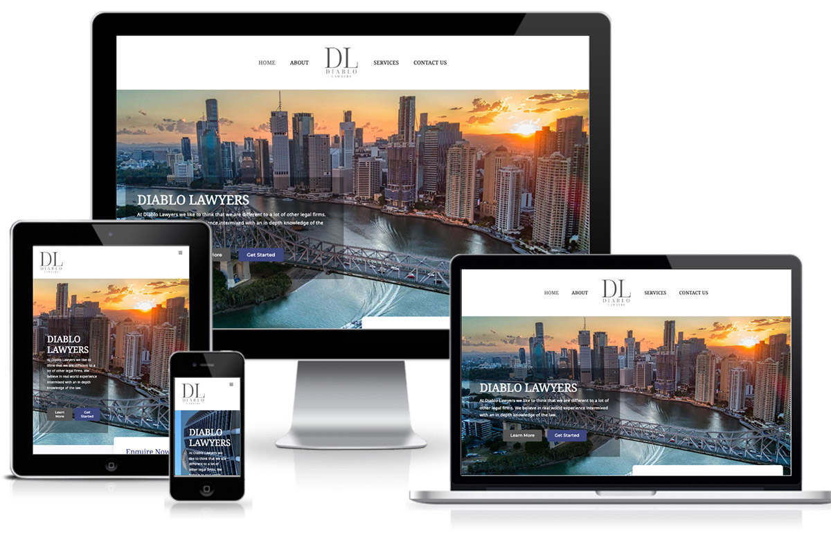
One design, every device
Adapts, performs, and converts on every screen
Whether you call it mobile web design, mobile-friendly, or responsive — it all means the same thing. A website that works on every screen.
It's not just about rankings. A mobile-friendly design keeps users on your site longer. When your site is easy to use, people are more likely to call, click, or enquire.
See responsive examplesAt a glance
What you get with a Scorched Media responsive build
- Mobile-first build, tested at 375 / 768 / 1024 / 1440
- Fast load times across slow mobile connections
- Touch targets sized for thumbs, not mouse pointers
- Readable typography at every screen size
- Optimised images for retina + low-bandwidth devices
- Same brand, same UX, every device
- Google mobile-first indexing ready
- Future-proof for new device classes
I had the pleasure of doing business with Darren from Scorched Media who designed me an absolutely fantastic website that draws clients to my business on a daily basis. A very professional job and an extremely approachable man. Couldn't recommend him highly enough!
What mobile-first delivers
FAQ
Common questions about responsive design
What is responsive website design?
Responsive website design means your site adjusts to fit any screen. Also called mobile-friendly design, it works smoothly across phones, tablets, and desktops, giving every visitor a clear, consistent experience.
Why is mobile responsive website design important?
With most users browsing on mobile devices, a responsive design improves user experience, reduces bounce rates, and boosts SEO rankings, helping your site perform better in search engines.
How does responsive design affect SEO?
Google prioritises mobile-friendly websites in search results. A responsive design improves site speed, user experience, and lowers bounce rates, all of which positively affect SEO rankings.
Do I need a complete redesign to make my site responsive?
Not always. While some websites may require a full redesign, others might only need adjustments to become responsive. We can assess your site and recommend the best solution.
Will responsive design keep my site up-to-date with new devices?
Yes, responsive design adapts to new devices and screen sizes, ensuring your website continues to perform well without frequent updates or redesigns.
Mobile-first
Need a site that works on every screen?
Responsive layouts, optimised images, fast load times. Built in from day one — not bolted on after.
Or call (07) 2100 2110